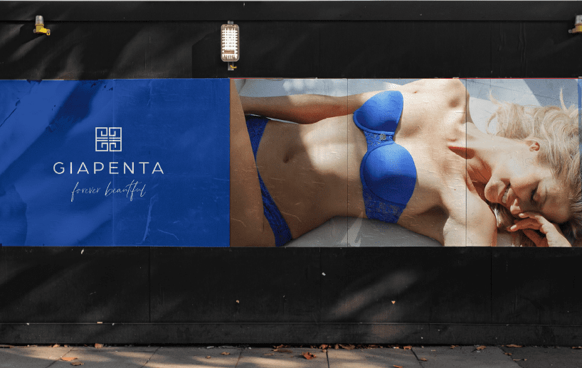
Giapenta, a Direct to Consumer lingerie brand, sits at the intersection of science, comfort and beauty. Female founder Kris Strouthopoulos saw a niche in the market, created a proprietary temperature sensitive fabric, and set out to create intimates with a patentable difference.

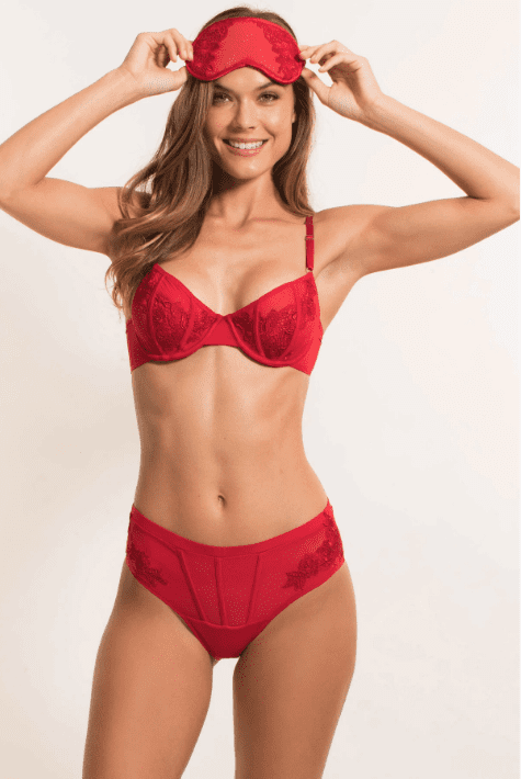

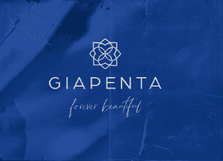
The name “Giapenta” hearkens back to founder Kris’s origin story. Based on the Greek word meaning “forever,” Giapenta’s design is bold, smart and intuitive for lasting style. But more than simply a designer brand, Giapenta is creating a community of strong diverse women carving their own paths with head and heart.
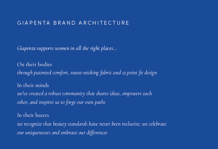
Bread worked with the Giapenta team to translate their ideas into a cohesive, iconic look and voice.
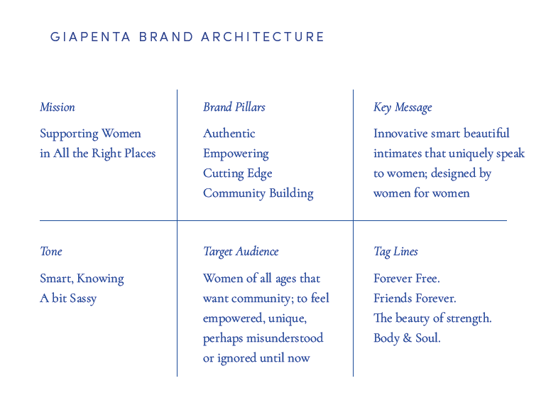
Starting with the brand architecture we helped them articulate their story through copy, taglines, and key messaging to ensure the Giapenta point of difference was loud and clear across all channels.
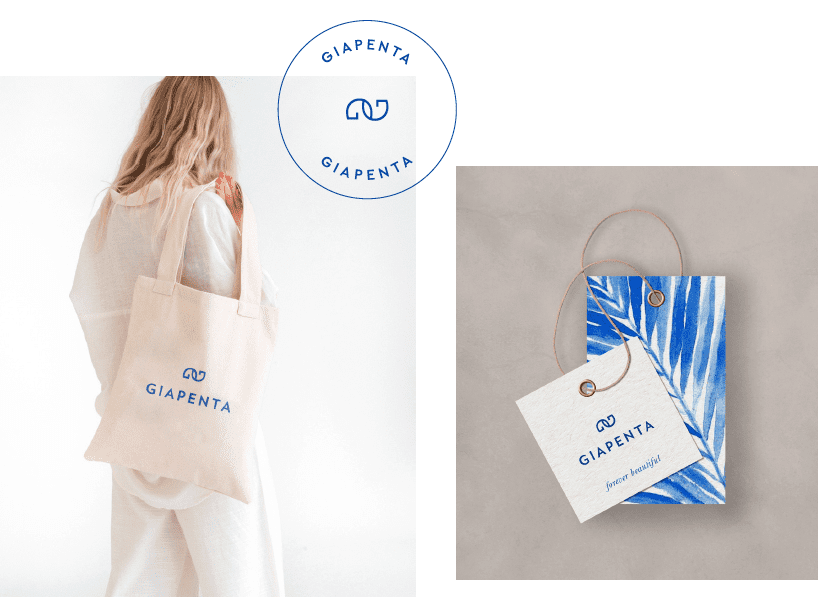
Communication Direction
Tagline Development
Logo and Icon Re-design
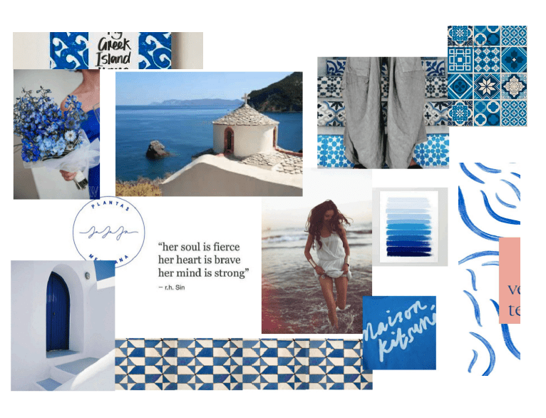
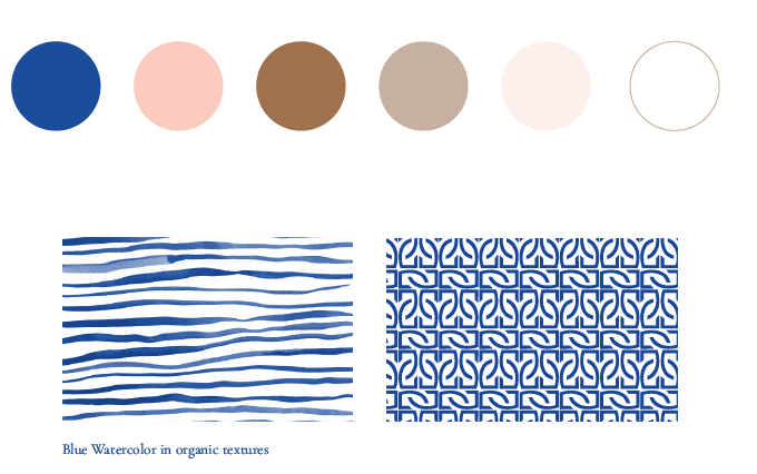
Color Palette, Typography, Pattern Direction
It is our pleasure as advisors and investors to watch the all female Giapenta team thrive!