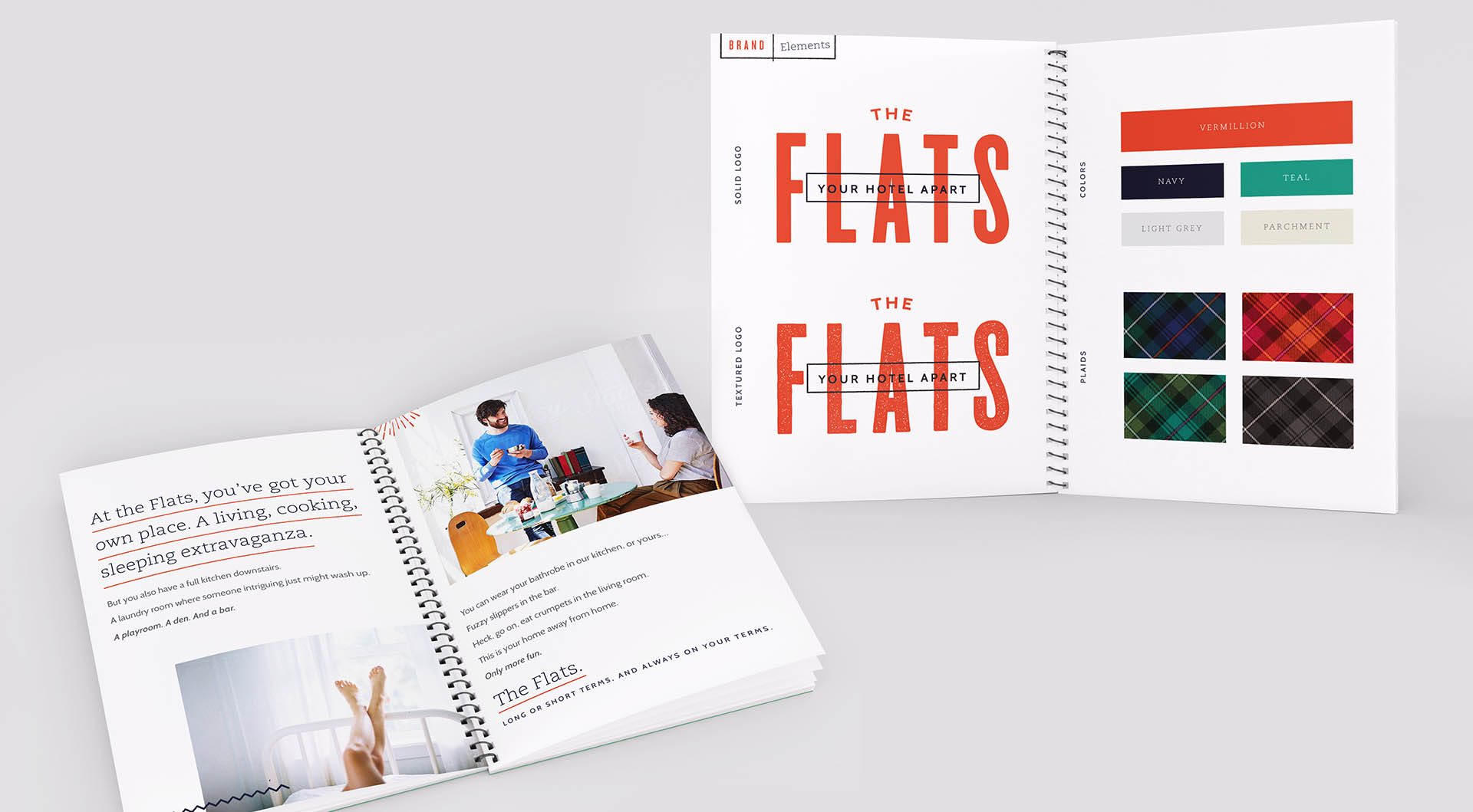
Starwood Capital Group London purchased a collection of one-off hotels. They were disparate properties with no commonalities tying them together. The partners at BREAD were engaged to unify the group, creating a powerful brand within the “extended stay” category. After touring the properties and analyzing the competition we identified a niche and developed a unique positioning and design direction they all could share.
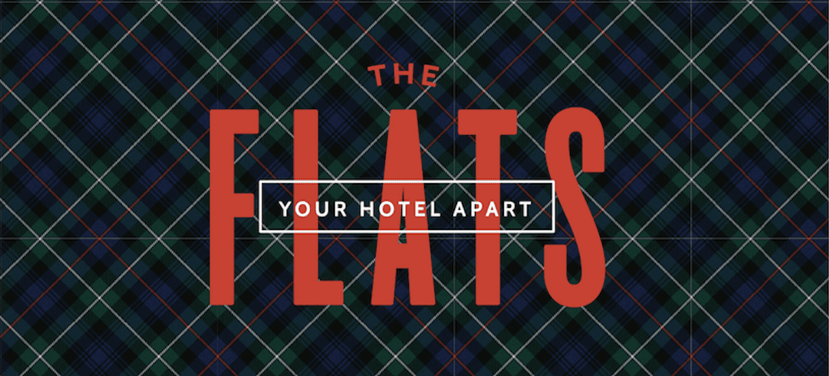
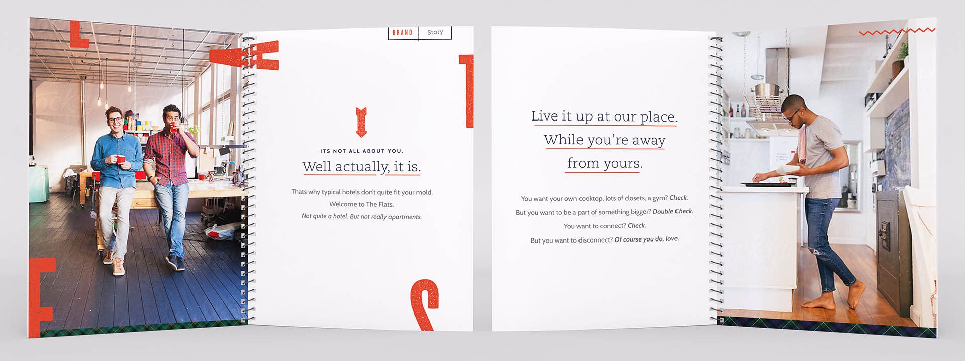
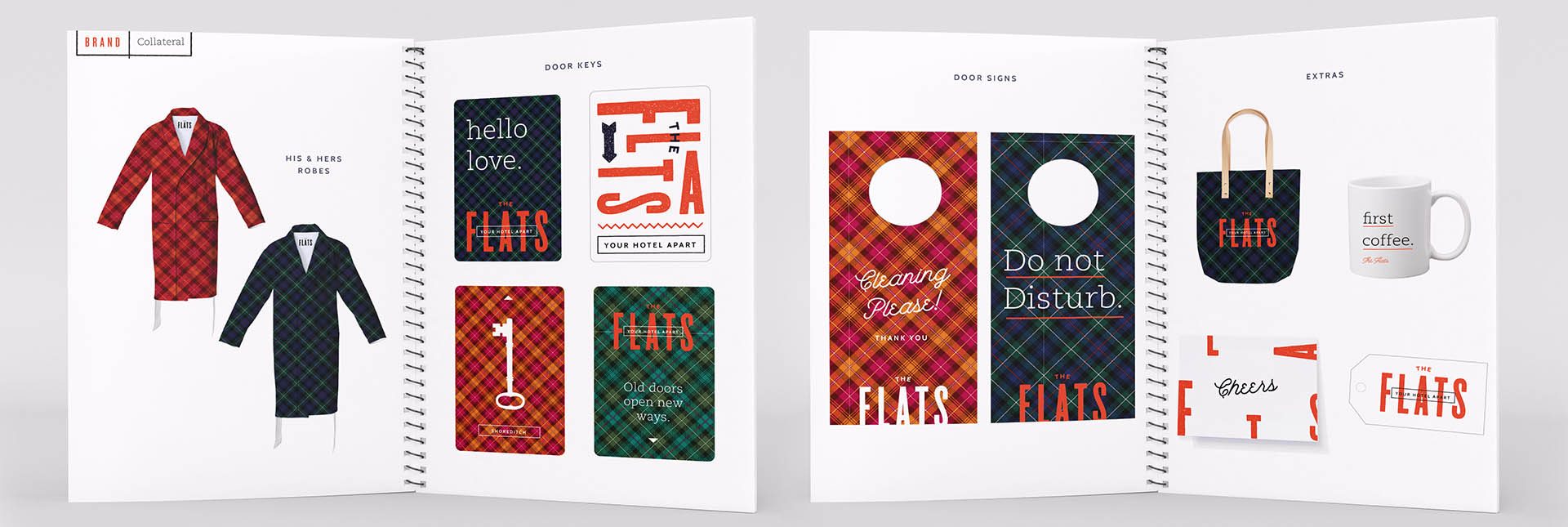
To appeal to an entrepreneurial social consumer, The Flats feature shared work space common rooms, creative snacks 24/7, a bold “British” plaid theme, and plush amenities like fuzzy slippers.

Market Research
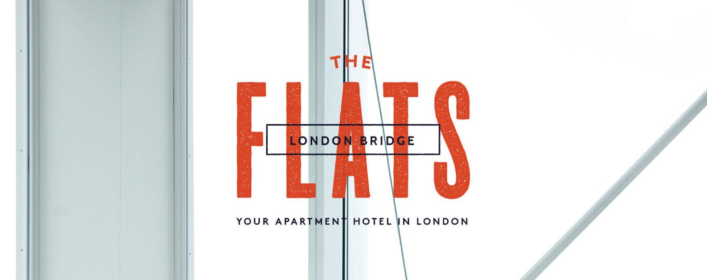
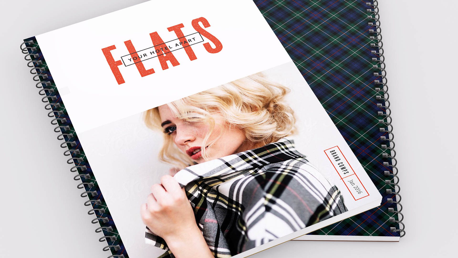
Developed iconic cohesive Brand Identity
Recommended Service Standards
Created consumer focused voice and messaging
Brainstormed new marketing ideas
Designed branded Merchandise + Apparel